Brand Designer
California
At Radiant, I served as the foundational brand lead during a pivotal stage of growth, building the Kaleidos micro-reactor identity from the ground up. Working directly with executive leadership, engineering, and marketing, I translated complex nuclear technology into a cohesive and scalable brand system. I established the core visual language — logo architecture, color systems, typography, iconography, and presentation frameworks — and extended it across investor decks, recruitment materials, trade show environments, and external communications.
Key Brand Artifacts:
These visual systems defined Radiant’s operating language and structural logic.
Governance: Protecting the Core Asset
The clear space system defines a minimum buffer based on the width of the Radiant “R,” creating a measurable standard that protects the logo across all applications. This rule transforms preference into policy.
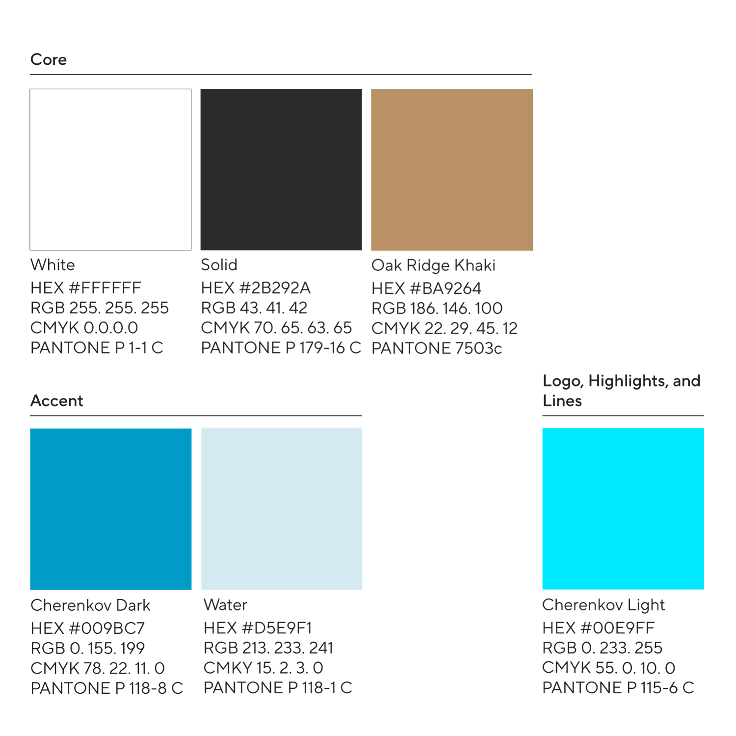
Designing the Brand’s Operating Palette
I established clear rules for how and where each color functions—core, accent, and restricted-use applications—complete with production specifications across digital and print. This transforms color from aesthetic choice into a disciplined, repeatable system.
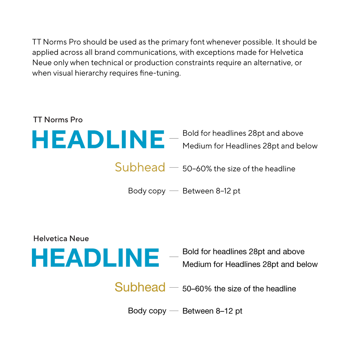
Establishing Typographic Discipline
The typographic system defines measurable hierarchy rules, including weight thresholds, proportional scaling, and platform-specific fallbacks. By codifying when to use Bold versus Medium and structuring a Helvetica Neue alternative for enterprise environments, typography becomes governed infrastructure rather than stylistic preference.
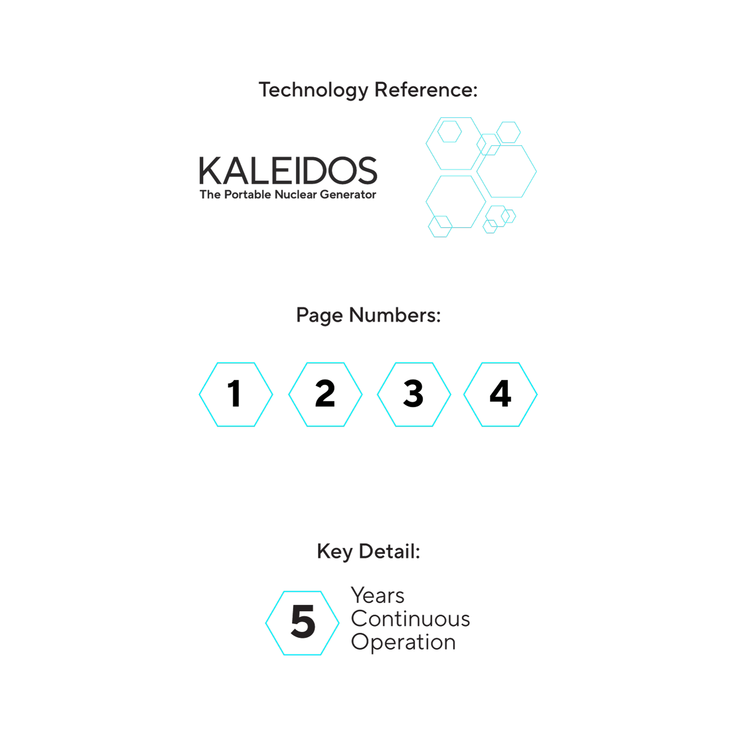
Structure: Applied System Components
The hexagon framework scales into practical brand utilities—from technology references and pagination to key data callouts. By standardizing these components, the system ensures consistency across documentation, presentation, and long-form technical materials.
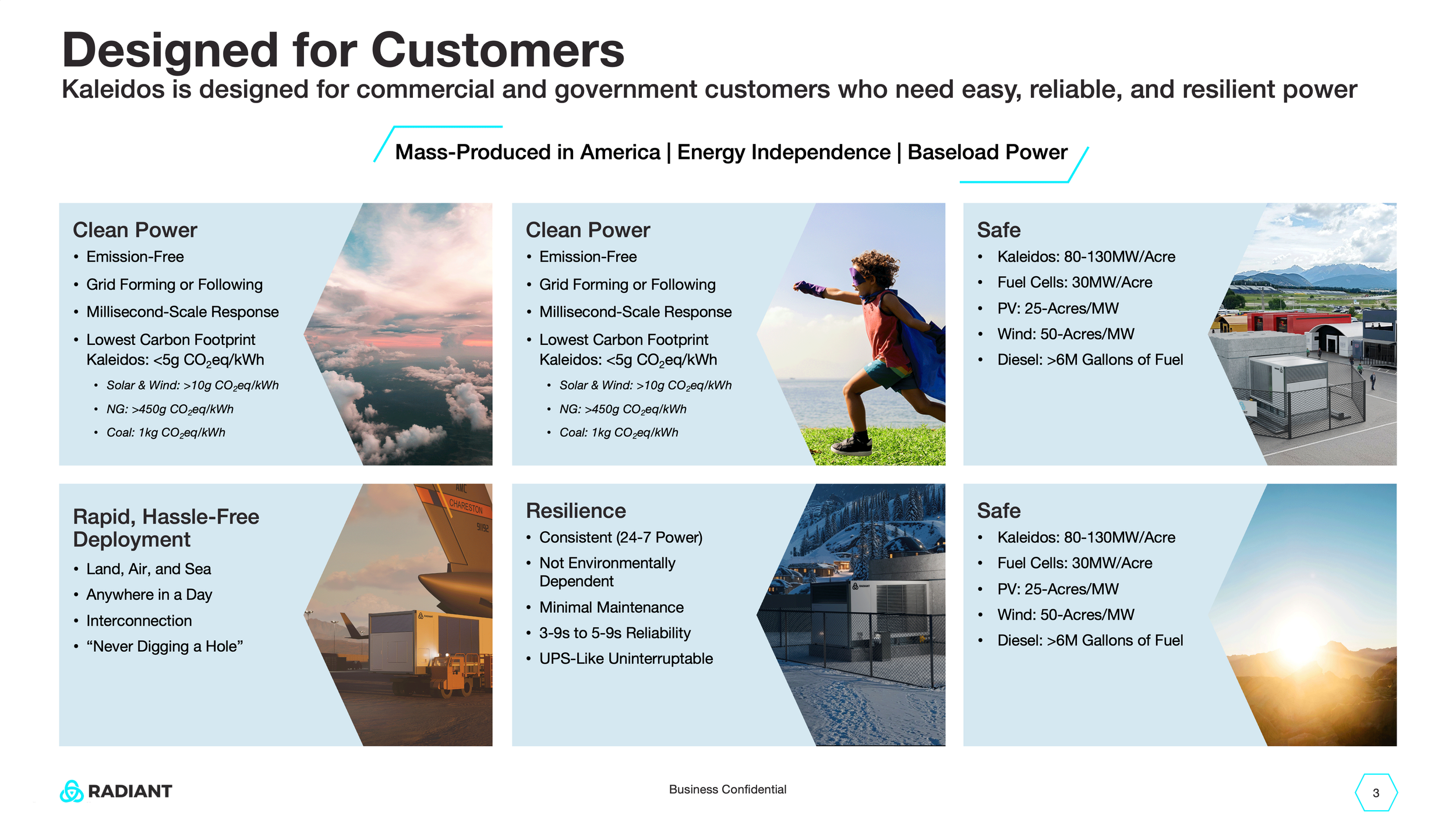

Structuring Complex Product Communication
A modular hexagon system organizes technical features, deployment benefits, and operational advantages into a structured visual framework. The design translates dense engineering information into clear, scannable messaging tailored for both technical and executive audiences.
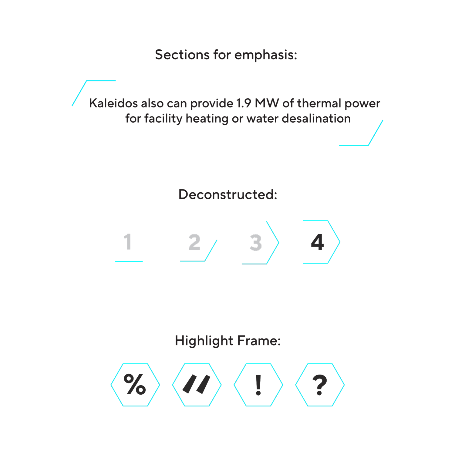
Structure: Modular Emphasis System
The hexagon language extends beyond symbolism into a functional emphasis system. Through deconstruction, framing, and sectional markers, the geometry guides attention, organizes hierarchy, and creates consistent visual rhythm across complex technical communication.
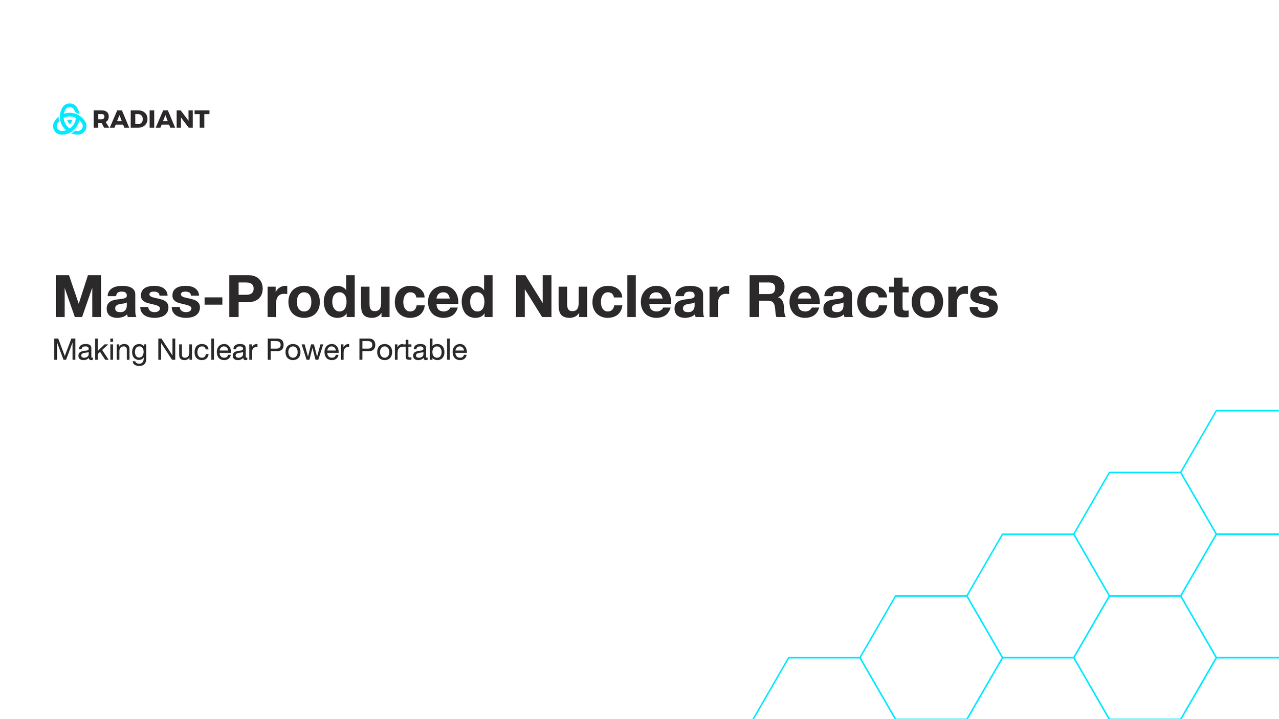
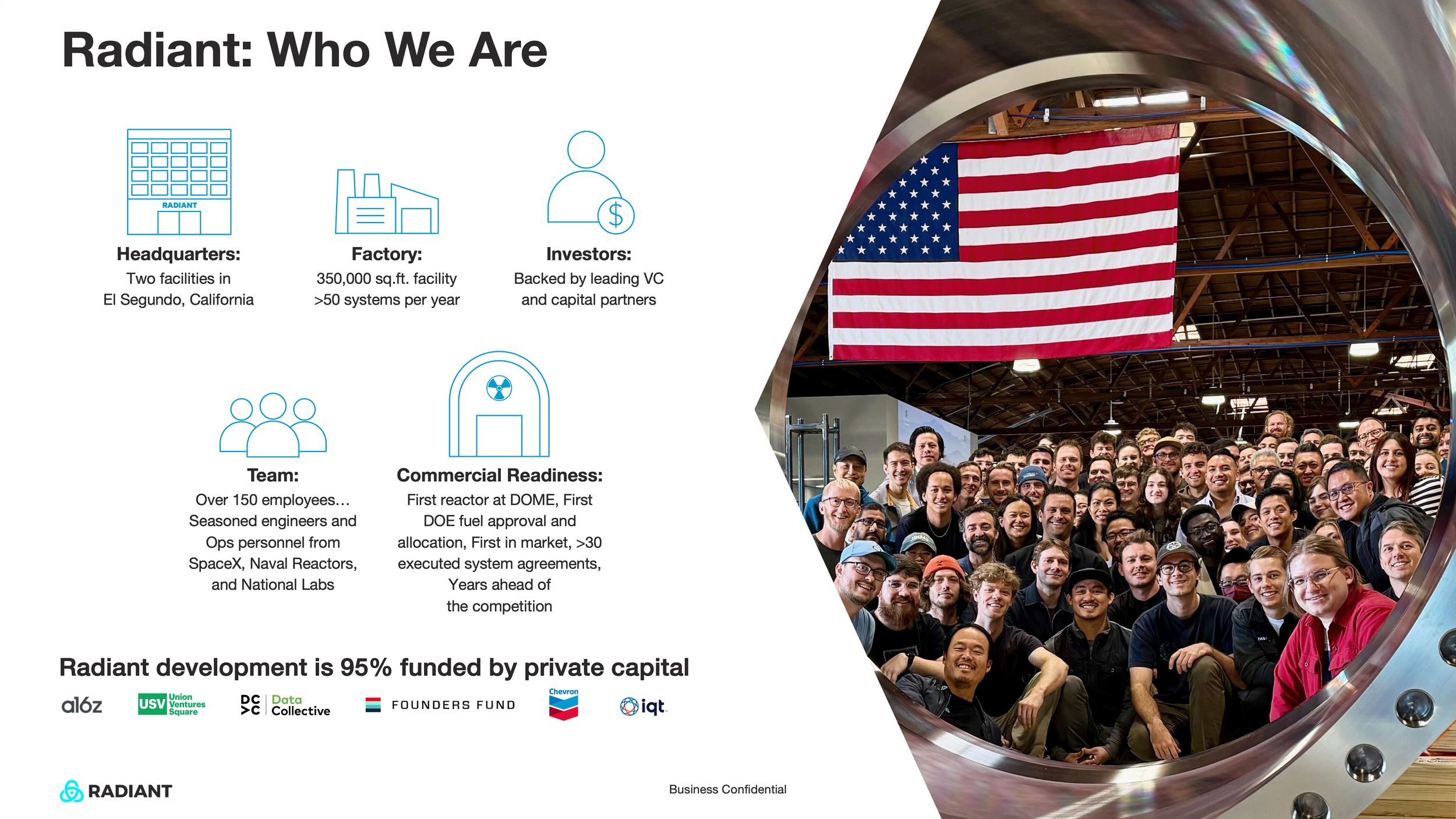
Framing the Mission
The opening slides establish Radiant’s narrative and strategic positioning. Clear hierarchy, restrained typography, and modular geometry create an accessible introduction to complex nuclear technology while reinforcing credibility with government and commercial stakeholders.
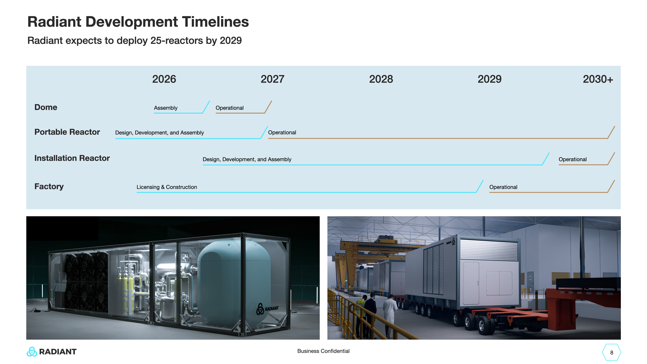
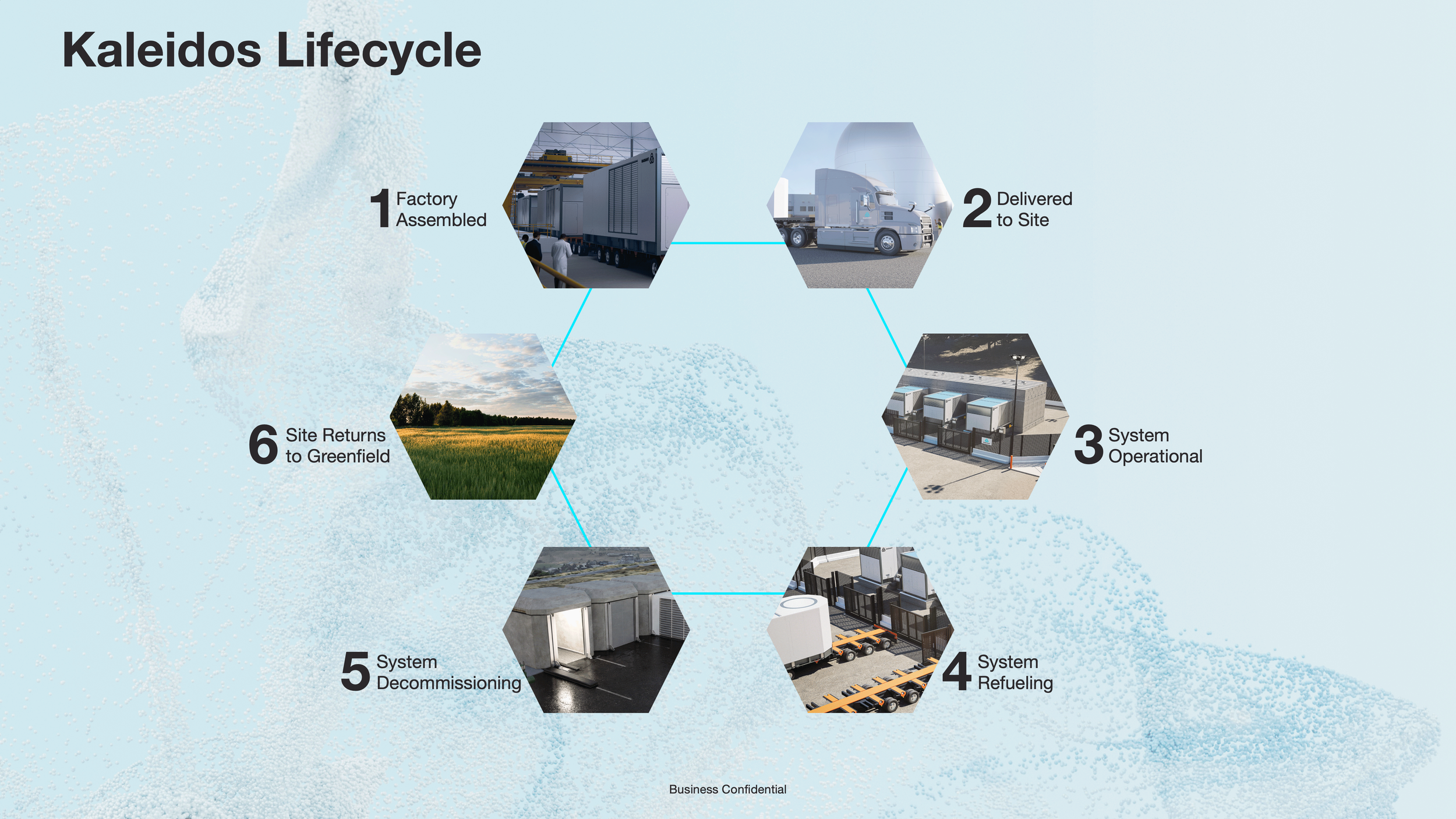
Visualizing Systems Thinking
Development timelines and lifecycle diagrams extend the geometric language into a cohesive storytelling system. The result is a scalable framework that communicates technical progress, operational flow, and long-term deployment strategy with clarity and visual consistency.
What began as a set of design artifacts became a living brand operating system that empowered Radiant’s internal teams, external partners, and high-stake communications.