
Brand Designer
Defining Control Within Chaos
Chaos required more than an identity—it needed a unifying system capable of expressing deep science, advanced engineering, and long-term vision. I developed a rule-driven brand framework anchored in symbolic meaning, modular grid systems, and disciplined typographic governance to ensure clarity across every medium.
California
Philosophy & Meaning
Building from First Principles
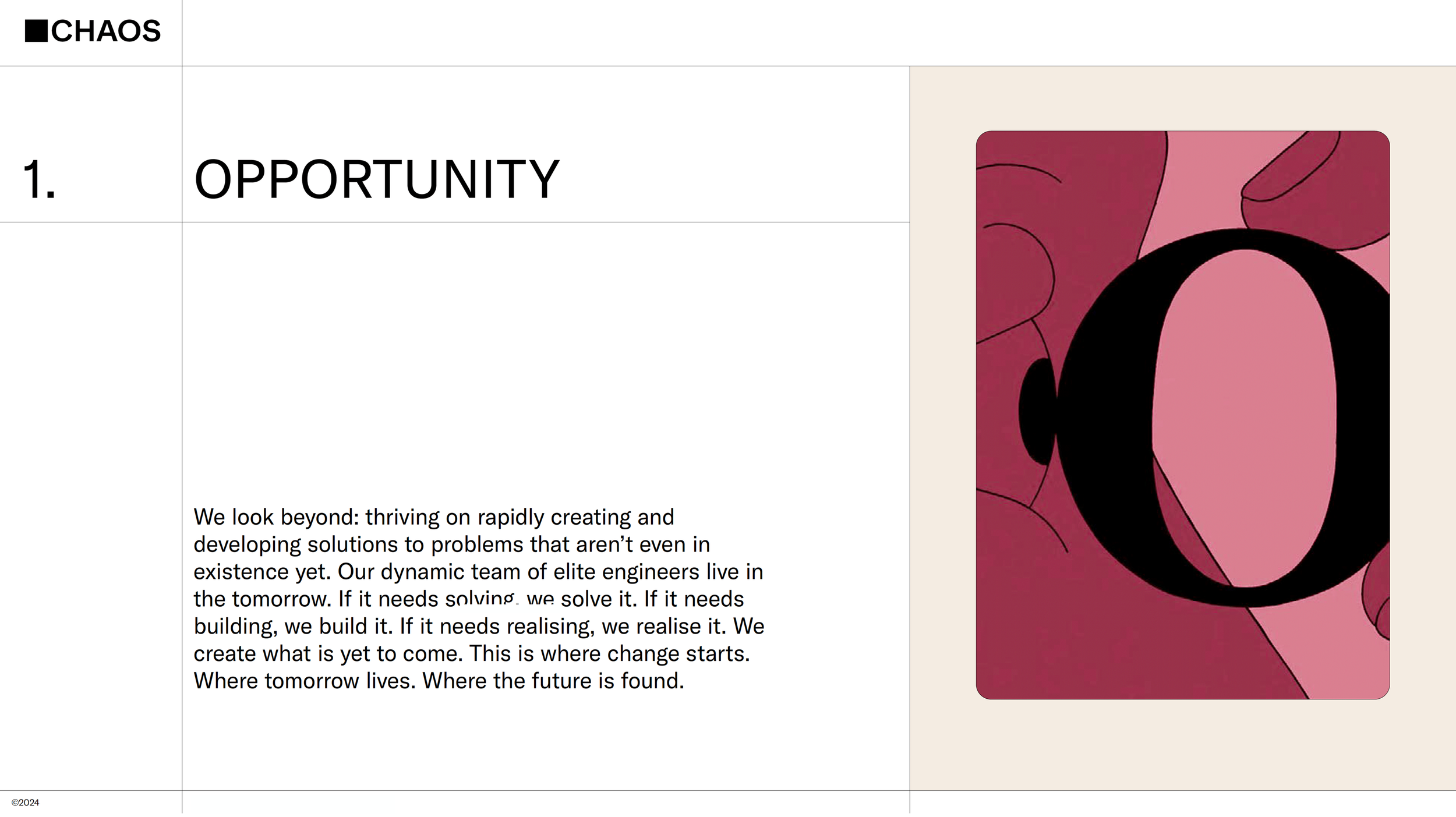
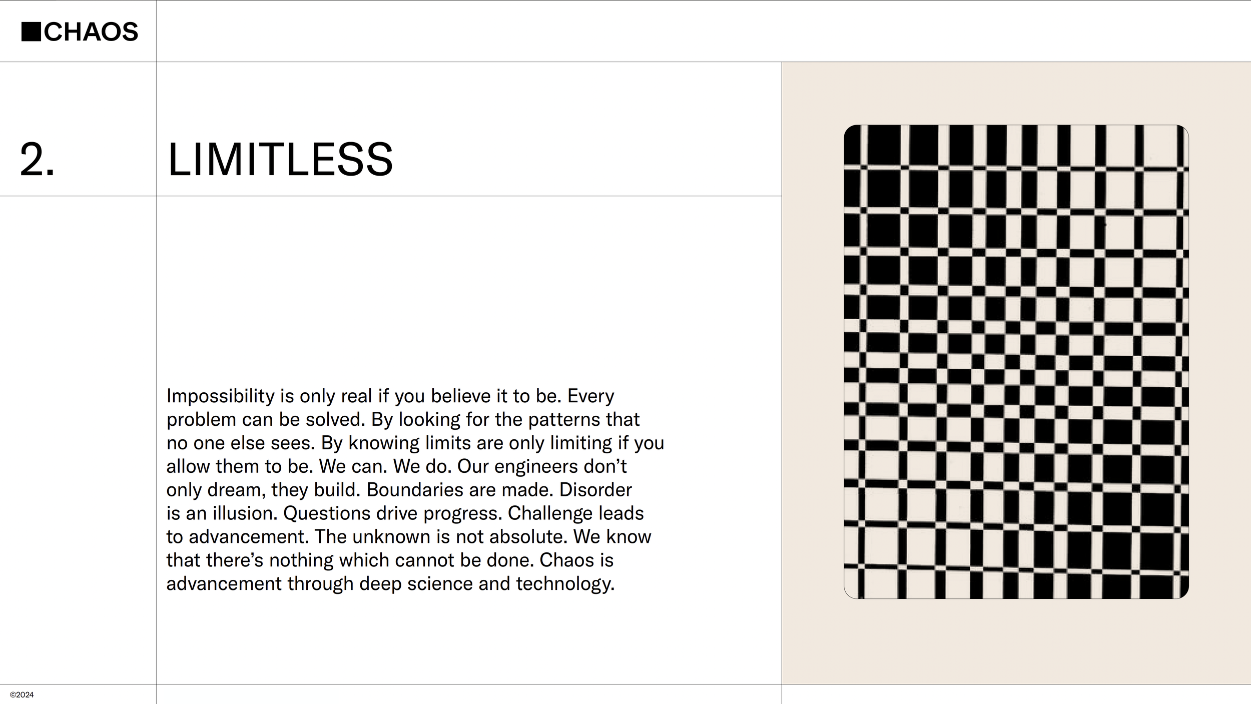
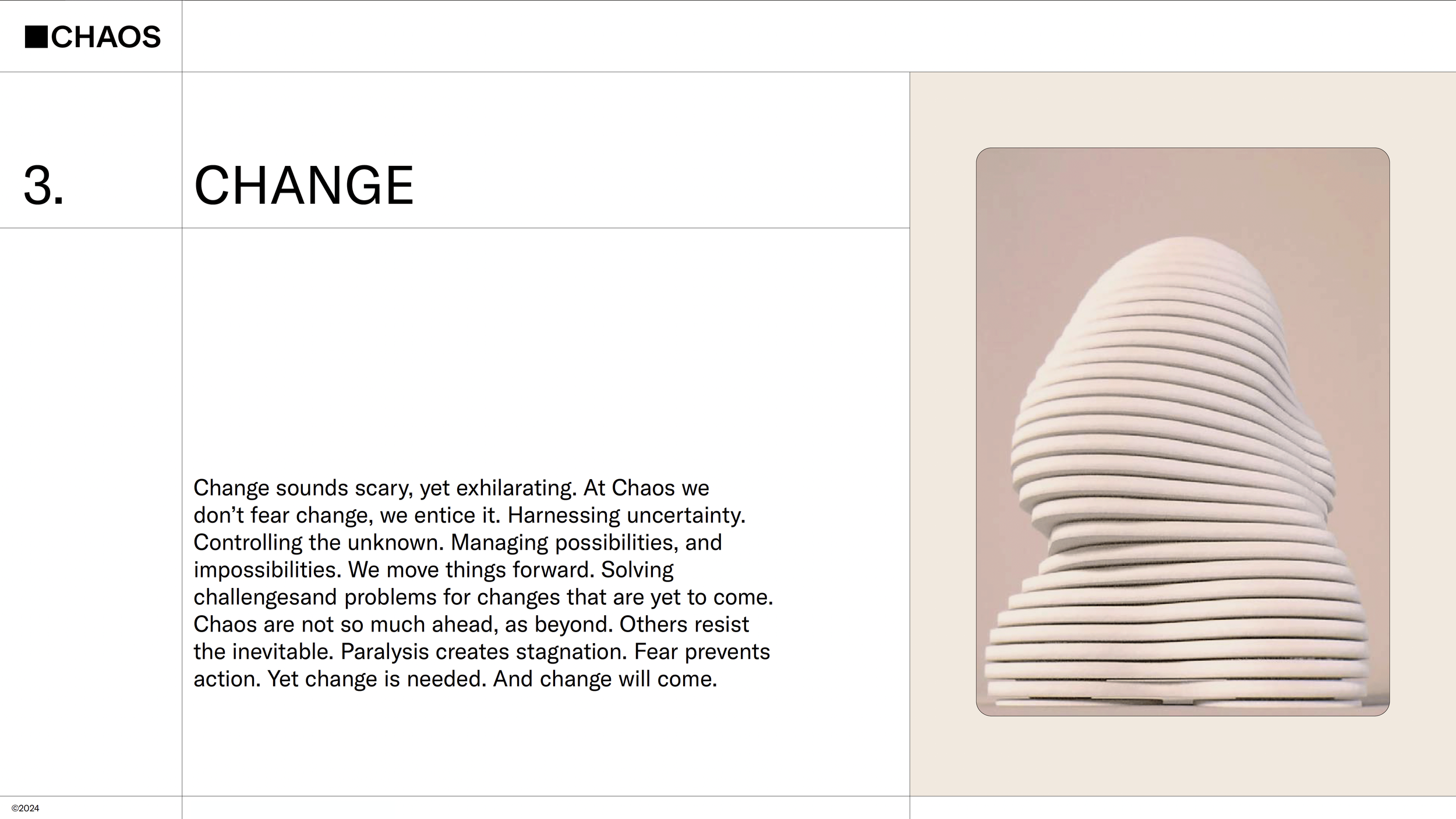
Rather than starting with aesthetics, the Chaos system begins with philosophy. The pillars—Opportunity, Limitless, and Change—form the intellectual backbone of the brand, shaping tone, structure, and visual language across every touchpoint.
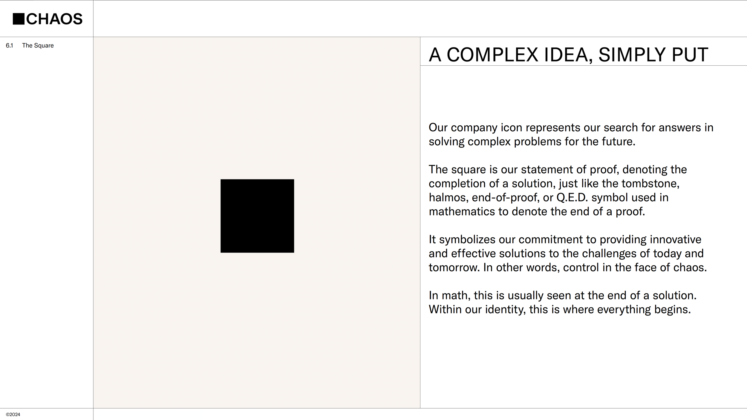
A Symbol of Proof and Control
The Chaos mark is rooted in the mathematical end-of-proof symbol, transforming a simple square into a statement of intellectual authority. It represents clarity after complexity—control in the face of uncertainty—and establishes a conceptual foundation for the entire identity system.
Structural Systems
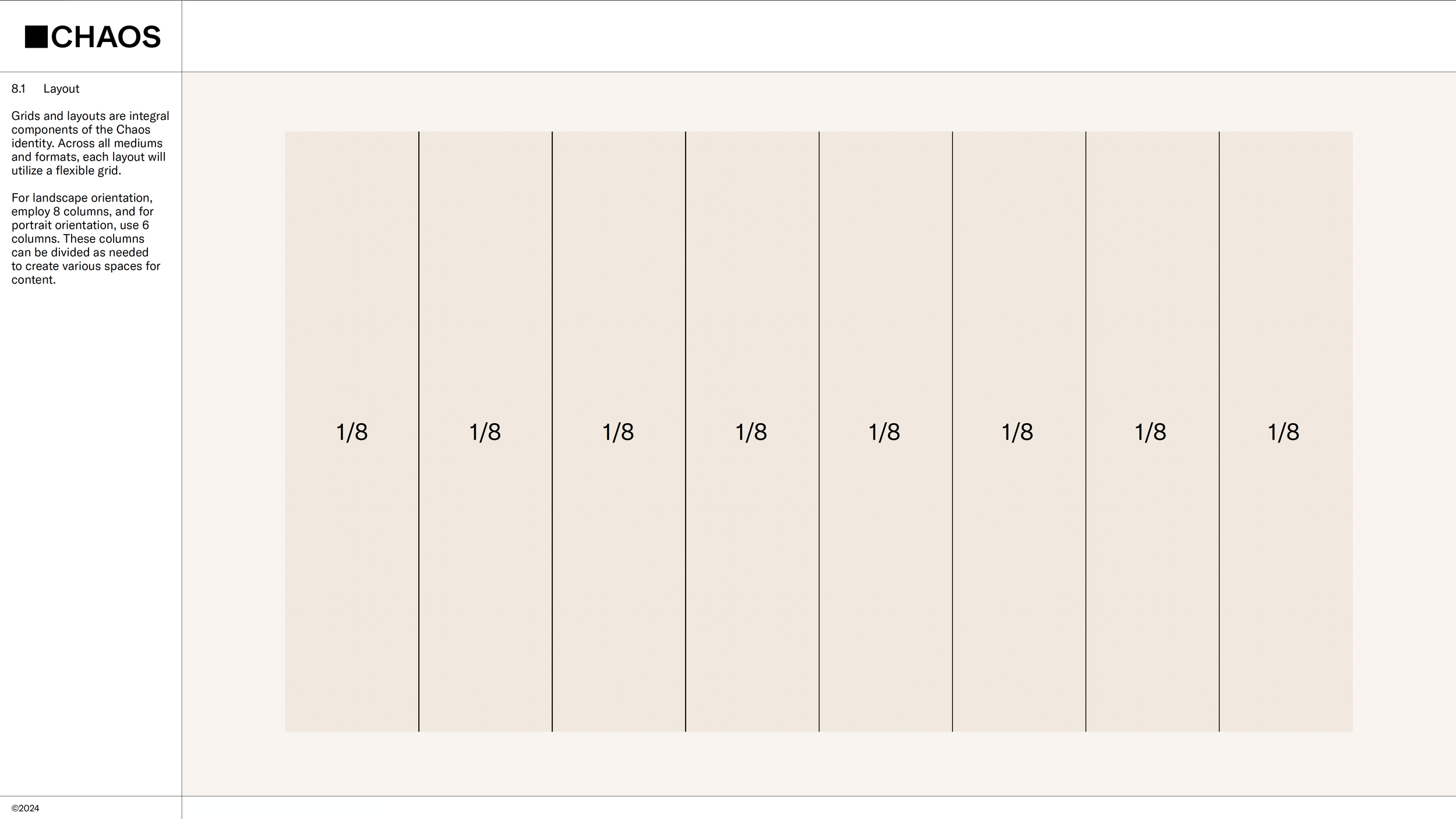

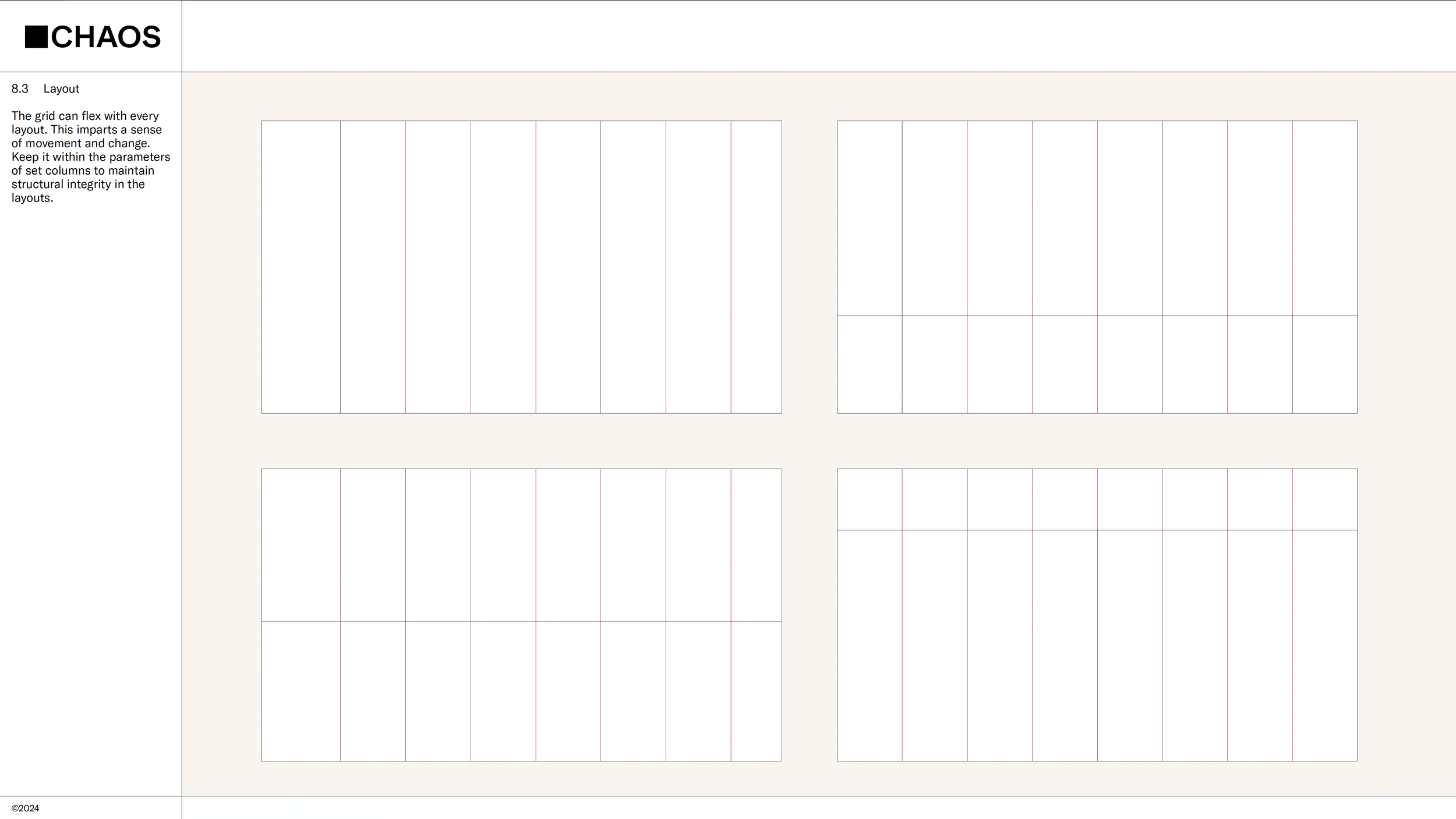
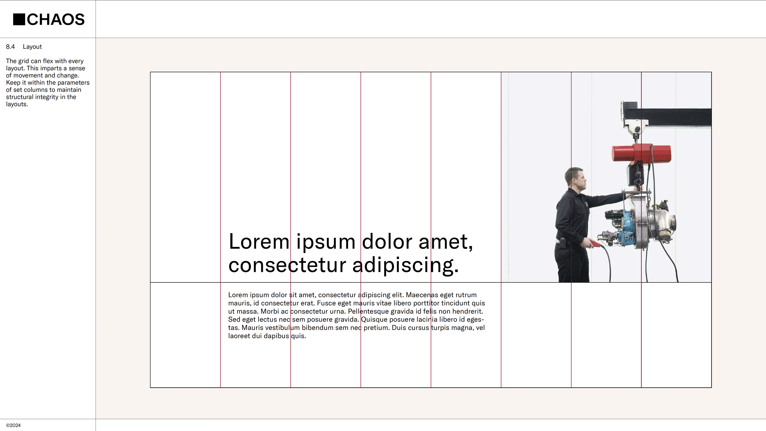
Engineering the Grid Framework
I established a disciplined column system—8-column landscape and 6-column portrait—to create structural consistency across all mediums. The grid flexes to accommodate content, but remains governed by fixed parameters, reinforcing clarity, order, and technical precision.
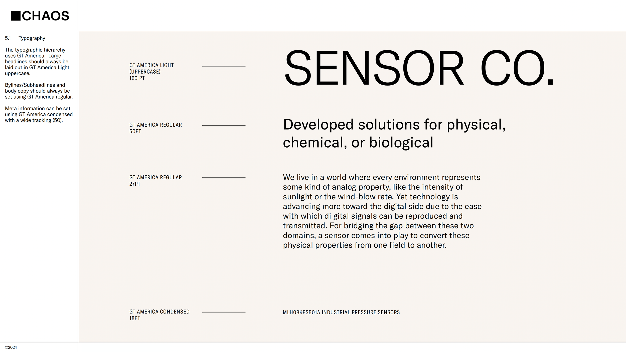
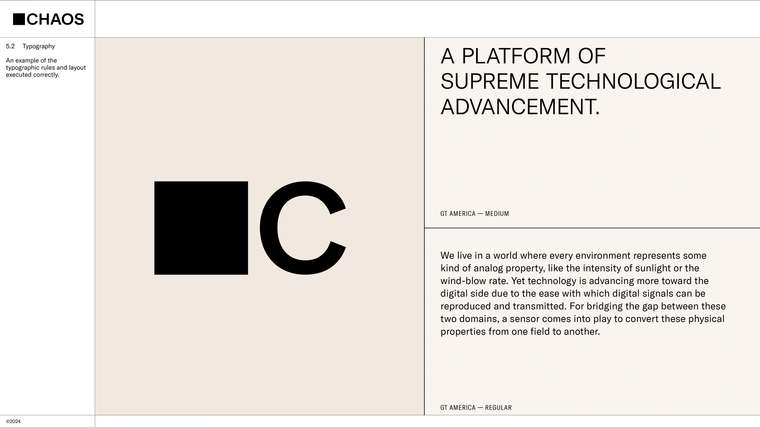
Establishing Typographic Discipline
The typographic system defines clear hierarchy rules—GT America Light for uppercase headlines, Regular for body, and Condensed for meta information with controlled tracking. These parameters ensure clarity, authority, and consistency across technical and investor-facing communications.
Strategic Deployment
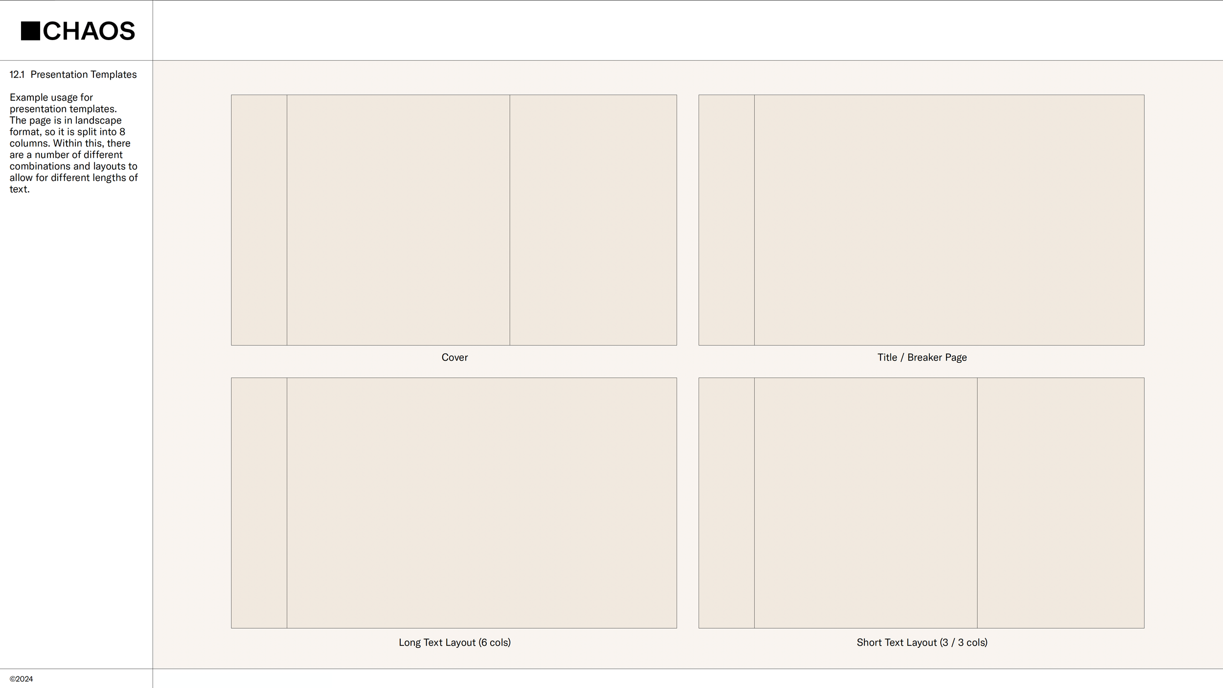
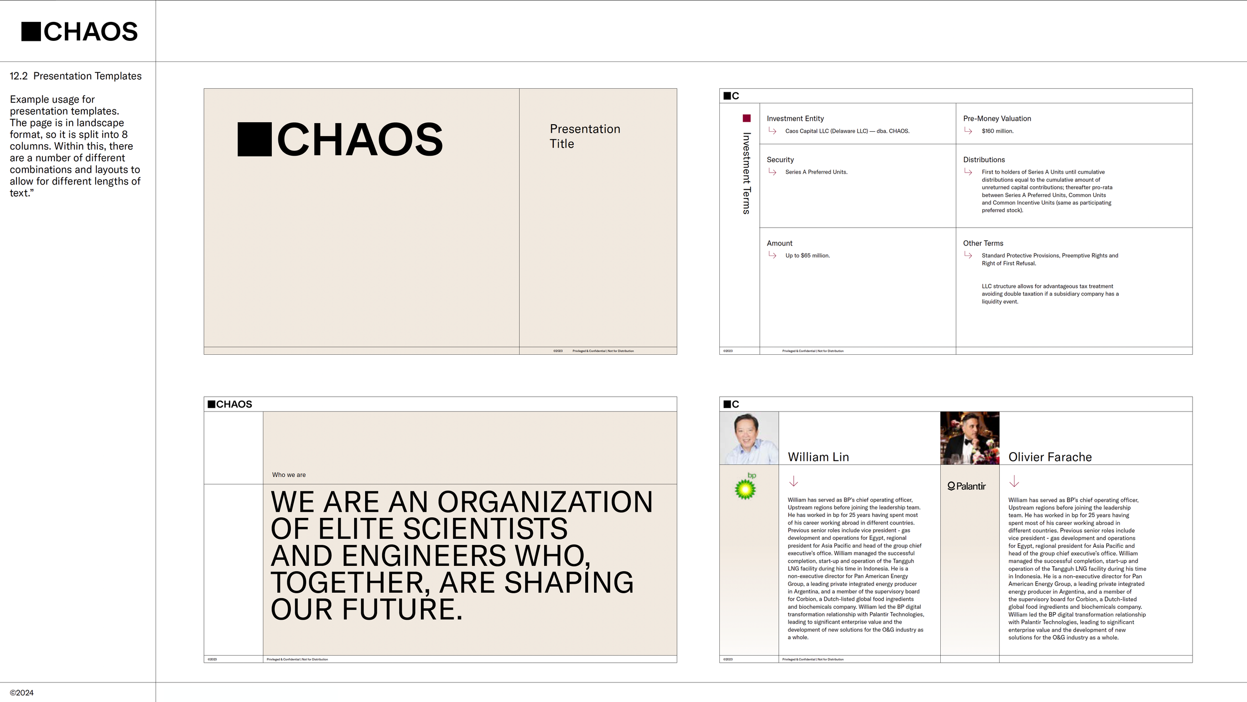
Operationalizing the Brand for Capital and Growth
I developed a modular presentation framework grounded in the 8-column grid system, enabling leadership to communicate complex technological ventures with clarity and authority. The system balances flexibility with structural discipline, ensuring consistency across investor, executive, and strategic communications.